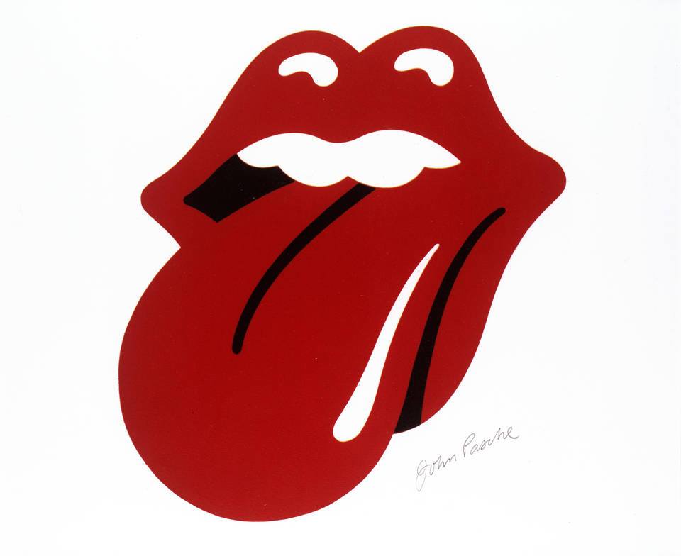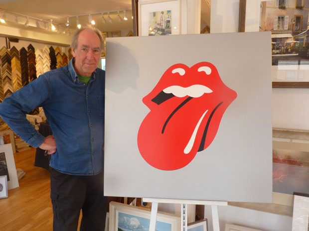
It is one of the most well-known logos in the world, but the now-famous “Tongue and Lips” design did not begin life with anyone believing it would be so iconic.
It would become common for bands to create their own official group brand logo, and the Rolling Stones are believed to be the first ones to do it. The decision was taken in April 1970. They were free of their previous record contract and looking at a new beginning. As part of that, it was felt that the Stones needed an “identity.”
The band began searching for a young artist to come up with a suitable poster for their imminent Europe tour. Jagger had Jo Bergman phone the Royal College of Art for possible candidates. It was one of the tutors at the Royal College that suggested a 24-year old postgraduate student named John Pasche.
In 2015, Pasche remembered: “One day the lady in the office came through. She said ‘The Rolling Stones have rung up – do you want to go and meet with them?’ and it was to talk about the 1970 tour poster. I met with Jagger in this large meeting room in Maddox Street [The Rolling Stones’ office].”
Jo Bergman’s letter to John Pasche after this meeting makes it clear that they were looking for something instantly identifiable as the Stones – a graphic identity. “We have also asked you to create a logo or symbol which may be used on note paper, as a programme cover, and as a cover for the press book.”
Shortly after, Pasche recalls Mick wanting to meet again: “He asked me back to talk about the logo. I went to his house in Cheyne Walk and he presented me with this printed image. He’d got from his local Indian corner shop of Kali, the Hindu Goddess of Time, Change, Power and Destruction. He’d got them to take it off the wall. I just immediately saw the mouth and tongue. The fact that Jagger’s physique was similar was a lesser consideration. The starting point was Kali. For me, creating a symbol for them like that was really an anti-authority gesture.”
When Pasche first presented his ideas there were some different iterations. According to Pasche, “there were variations of angles and tones of the tongue and lips.” Eventually, one was settled upon. “It took about two weeks in all, I was sitting there every evening working on it non-stop. Having got the basic idea I was trying to make it as simple as possible so that it could be easily reproduced.”

After the idea for the logo was finalised, there were two slightly different versions of his iconic design. This was due to a malfunctioning fax machine that blurred the image when it was sent to the States. The logo ended up having to be redrawn by another artist.
Close to half a century after Pasche’s “anti-authority gesture” was first put down on paper, it has become one of the most instantly recognisable and financially lucrative logos on the planet. It is practically on par with the logos of Nike and Coca-Cola. It was originally just intended for limited use in print, but the invention of the “Tongue and Lips” symbol marks the moment when the Stones became not just a band, but also a brand. The logo was a major factor in making this so.
For many years, the tongue logo was believed to be the work of Andy Warhol. The confusion stemmed from the Sticky Fingers album cover where the logo first appeared. That cover was the work of Warhol, and many assumed the logo was part of the total package that he had created.
Over the years there has been much talk of just how John Pasche was rewarded for his effort. In March 1971 he was paid 50 guineas (around £1,000 in today’s money) for designing the most famous logo in the history in rock. In October 1972 he was paid an additional £200 for the “success” of the tongue logo; over the coming years he received some additional undisclosed royalty payments. In 2008, the V&A Museum in London bought Pasche’s original artwork of the tongue and lips for £50,000.


Facebook Comments