")
Black Sabbath’s eponymous debut album was released on 13 February 1970. It was even a Friday the 13th. If that wasn’t an omen in itself, the start of the album – the ominous title track which names both the album and the band – is a bone-chilling aural assault which hasn’t lost an ounce of its power over the years.
The song’s guitar riff could not have been simpler, but carries a deeply foreboding and grounded aural disharmonic resonance, as well as the heaviest sound anyone had ever heard at that point, primarily due to guitarist Tony Iommi’s tuning and playing style. The song still gives listeners chills. Back then, it was downright terror-inducing. Nobody had ever heard anything quite like this before. A new genre was born.
Listeners may have hoped for some quarter by the time Ozzy Osbourne’s vocals would come in. Surely the presence of a vocalist would offer some solace from the incredible feeling of foreboding instilled by the music, but no such luck. If anything, things get creepier.
What is this that stands before me?
Figure in black which points at me…
These opening lines have always had strong ties to the album cover, which depicts exactly the kind of mysterious figure in black that is mentioned in the song, standing in an eerie-looking and somewhat otherworldly setting.
The band can however not take the credit for the album’s sleeve. The album was released on Vertigo Records, a new subsidiary of the Phillips/Phonogram label (in fact, theirs was only the sixth album released on the label). Other artists on the label included Coliseum, Rod Stewart, and Manfred Mann. The visual style of Vertigo’s album sleeves were consistent because they were the work of the same man. But who was he?
The album credits didn’t say much about the person behind the sleeve designs. All fans had to go on was a credit that said, “Album designed and photographed by Keef,” a name that would also appear on the next three Black Sabbath albums. He was later referred to by the somewhat fuller name Marcus Keef, although we know now that his full name is Keith Macmillan.
Macmillan began his work on Black Sabbath by playing the album off a quarter-inch mater tape. “If I remember rightly, I just listened to the music,” he told Rolling Stone Magazine in 2020. “Obviously, the lyrics go in the back of your mind, but it was more just the overall vibe that struck me. Sorry to talk like an old hippie, but you have to go with a kind of overall feel for the art.” He says that the album expanded his musical horizons: “To be honest with you, it was the first time I really enjoyed that kind of heavy rock, metal. I wasn’t really into it before, but that album made me a fan for life.”
The photographer was relatively fresh out of the Royal College. He had recently discovered surrealism, so he drew on that movement for his designs. A visit to an exhibition by the Belgian surrealist René Magritte at the Tate Gallery in London in early 1969 had particularly inspired him. When the time came to create something for Black Sabbath the following year, he had a deep well of ideas. The opening lines of the opening track gave further inspiration.
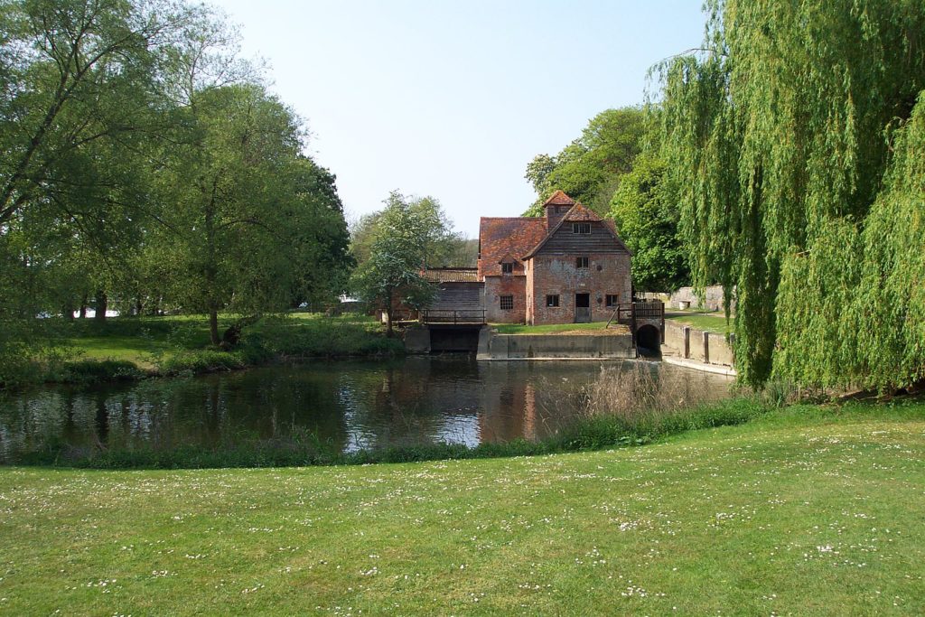
He decided that the shoot should take place at the Mapledurham Watermill, situated on the River Thames in Oxfordshire, England. The historic building dates back to the 15th century, and he felt it fit the dark, gothic sound of the band. He had initially found it with one of his college girlfriends, who lived near it, and had remembered taking a walk around it. “Nowadays it’s very much more modernized, beautified, and touristed,” Macmillan told Rolling Stone. “Then, it was quite a run-down and quite spooky place. The undergrowth was quite thick and quite tangled, and it just had a kind of eerie feel to it.”
Macmillan contacted Annie Walker’s London model agency, asking for a woman who could portray the ominous figure he had envisaged for the shot. He received several portfolios, from which he picked out Louisa Livingstone. Her identity would not be widely known until 2020 when Rolling Stone Magazine interviewed her for a 50th Anniversary feature.
The identity of the figure in the cover image has always been debated. Everything has been said: she was a real witch, it was really Ozzy in drag, the photo was taken at an actual “black sabbath,” and perhaps the best one: There was no woman at the photo shoot – the ghostly figure only appeared when the film was developed. As fun as the legends are, that’s all they are: stories.
Louisa Livingstone is five feet tall. This was part of the reason she was chosen, as it was felt this would make the scenery around her look bigger. She has always had brown hair with a reddish tint, although this is not apparent in the sleeve photo due to the effects used. Livingstone had started modelling for Annie Walker not too long before, and was in her late teens at the time of the Black Sabbath shoot.
“I’m sure he [Macmillan] said it was for Black Sabbath, but I don’t know if that meant anything much to me at the time,” Livingstone recalled, adding that it had been “freezing cold” during the shoot. “I had to get up at about 4 o’clock in the morning. Keith was rushing around with dry ice, throwing it into the water. It didn’t seem to be working very well, so he ended up using a smoke machine.”
Her most vivid memory of that day is just how cold and dark it was. Neither the photographer nor model remember exactly when during the year the shoot took place, but it had to be sometime between the November 1969 sessions for the album and its February 1970 release date.
For the look of the cover, Macmillan used Kodak infrared aerochrome film, which was designed for aerial photographs and gave the portrait its pinkish hue. You can see a similar look on Colosseum’s Valentyne Suite album. He would later do some further tweaking of the photo to get a slightly dark, surrealistic, evil kind of feeling. Since it was sensitive film, he would boil it and then freeze it, to make the image grainy and undefined.
In order to capture the infrared light for his film, Macmillan wanted to get to Mapledurham as early in the morning as possible, and they also had to take an 80-plus minute drive from London into account. “I had to get up at about four o’clock in the morning, or something as ridiculously early as that,” Livingstone told Rolling Stone. “It was absolutely freezing. I remember Keith rushing around with dry ice, throwing that into the pond nearby, and that didn’t seem to be working very well, so he was using a smoke machine. But it was just one of those very cold English mornings.”
To add to the vibe, Macmillan had brought some props with him to the shoot. One was a taxidermy crow, which he placed on a tree stump that can be seen on the album’s back cover. “We had him wired onto a tree,” he says. “His name is Yorick. He used to sit in my studio.”
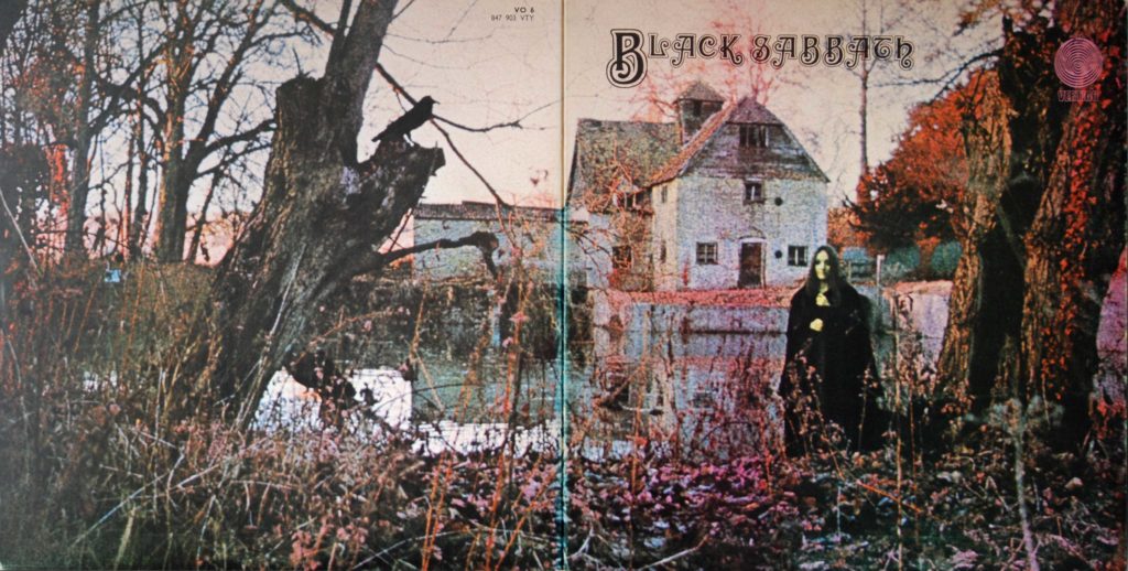
The other prop was a real live small black cat, which Macmillan borrowed from a friend. Livingstone can be seen holding it in the picture and is certain that she is holding it in the cover shot. However, she doesn’t remember a cat. “I think it might just be the way my hands are there,” Livingstone said. “I’m sure I could remember if it was a cat.”
The reason Livingstone’s hands are where they are in the photo, cat or no cat, is because she was trying to keep warm. According to Macmillan, Livingstone was wearing nothing underneath the black cloak as they were also doing some experimentation involving some “slightly more risqué” photographs. ”We decided none of that worked” Macmillan recalled. “Any kind of sexuality took away from the foreboding mood. But she was a terrific model. She had amazing courage and understanding of what I was trying to do.”
Macmillan is full of praise for his young model, who did not need much direction to naturally do what felt right. “As a photographer, I tend to just set the mood,” he said. “And if you’ve got a model who understands the mood, rather than specific direction, then you tend to get a more naturalistic effect. If you over-direct, as a photographer, in my opinion, it looks a little more staged. And I think one of the charms of that album, it just looks snapped. It just looks like an instant of something that was actually going on.”
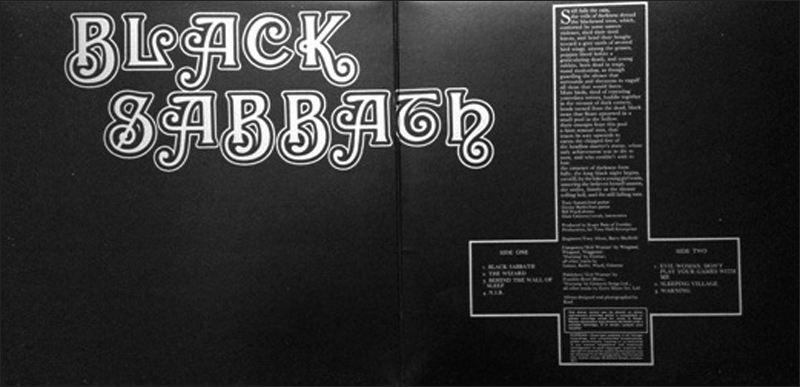
Once the photo was done, work began on the rest of the packaging. One of Macmillan’s fellow students from the Royal College of Art, Sandy Field, designed the typography for the Black Sabbath logo, as well as the inverted cross. “As far as I recall, the idea of the upside-down cross was partially because it provided a strong graphic image to frame the poem and credits, and partially to bring a sense of the occult to the design,” Macmillan says. “It was not intended to be anti-Christian or satanic. After all, the inverted cross is often referred to as St. Peter’s Cross.”
The inverted cross would not just contain song titles and credits, but also a rather unnerving poem. Among other nasty visuals, the text describes severed bird wings, poppies that bleed, and “mute birds, tired of repeating yesterday’s terrors,” all leading up to a line about how “by the lake a young girl waits, unseeing she believes herself unseen, she smiles, faintly at the distant tolling bell, and the still falling.” This was definitely playing on the album cover, making a stronger and more eerie (if possible) connection between the artwork and the music.
The only problem was that the band did not write it. It was Macmillan’s photographic assistant, Roger Brown, who decided to take a stab at writing the text. “I met Roger through Sandy Field,” Macmillan says. “Roger was at art college with Adrian Field, Sandy’s brother. We worked together, on and off, for many years. Roger had a great imagination, both with visuals and with words. He was a contrarian at heart and was never afraid of initiating controversy. Perfect for the Sabbath poem.”
…or was it really that perfect? The band were reportedly upset when they discovered the text. They were concerned that it would fuel allegations that they were satanists or occultists, which ended up happening. It is always easy to write controversial words when you’re not the one who has to live them down.
For a while, the total sum of the cover and image package would also draw strange characters toward the band. “Suddenly we had all these crazy people turning up at shows,” Iommi told Mojo Magazine in 2013. “I think Alex Sanders (high priest of the Wiccan religion) turned up at a gig once. It was quite strange, really.”
The liner notes to the 1998 Reunion album state “Unbeknownst to the band, Black Sabbath was launched in the U.S. with a party with the head of the Church of Satan, Anton LaVey, presiding over the proceedings… All of a sudden Sabbath were Satan’s Right Hand Men.”
“I hated it when I opened up the middle part [of the cover] and somebody put an upside-down cross in it,” drummer Bill Ward said. “I hated that because that wasn’t who we were. And nobody had talked to the band about that.… I think that they wanted a certain image, or they wanted it to be a certain way. I don’t know what they thought. But it gave us an image that we fought in the press over for maybe four or five years.”
As far as the cover image itself, the band was significantly more pleased. The band had recorded the album in a whirlwind two-day session and then gone right back on tour. No one at Vertigo asked them for their input on the art, so they were quite surprised when their manager first presented them with the full LP package shortly before its release.
“We really liked it, the album sleeve,” Iommi said of Macmillan’s handiwork. “We liked everything at first, it was really exciting because we’d finally got an album out and everything was exciting.”
Bill Ward was similarly pleased, saying “I love the front cover! I thought it was mysterious. It’s kind of like where we kind of hung our hats, to be honest with you. All that was fantastic to me.”
When the album was released on 13 February 1970, it did remarkably well given that it was the first album from a new and relatively unknown band. Word of mouth spread quickly, and the striking cover did not hurt either, helping it reach #8 in the UK Albums Chart. When it It was released in North America in May 1970, it reached #23 on the US Billboard Top 200, which is almost a more impressive achievement given how it came out of nowhere in that territory. It even remained in the charts for over a year.
This success came in spite of pretty harsh reviews. Black Sabbath were never press darlings. Most of their albums throughout the 1970s were given negative reviews by many critics; a tradition which started with the first one. Rolling Stone Magazine were not particularly known for embracing harder-edged music during the 1970s and 80s, and have embarrassed themselves plenty by writing reviews that has stood the test of time a lot worse than the albums they lambasted. Lester Bangs did it again this time, when he described Sabbath as as “unskilled laborers” and “just like Cream! But worse,” dismissing the album as “stiff recitations of Cream clichés that sound like the musicians learned them out of a book, grinding on and on with dogged persistence.”
The reviewer seems obsessed about likening them unfavourably to Cream – a band he does not like either! – dismissing the music as “filled with plodding bass lines over which the lead guitar dribbles wooden Claptonisms from the master’s tiredest Cream days” and “discordant jams with bass and guitar reeling like velocitized speedfreaks all over each other’s musical perimeters yet never quite finding synch”. One can wonder if he was reviewing Cream or Sabbath!
We can laugh at this today. The band has long since been vindicated from reviews like this one. Their first album sold in substantial numbers despite the critical panning, and has since been certified Platinum in both the US and the UK. More importantly, it has also been reappraised as one of the greatest and most influential heavy metal albums of all time, is widely regarded as the first true heavy metal album, and the opening track Black Sabbath has been referred to as the first doom metal song.
The album cover has always been a very important part of the album, setting the viewer up for what lies within. It has inspired countless bands ever since. The Mapledurham Watermill location has become a lovely museum attraction in its own right, and music fans no doubt make up a decent portion of the visitors. Remarkably, the watermill in the cover remains operational to this day, though the flour it grinds is used solely for the treats sold to visiting tourists.
Aside from the Black Sabbath album cover, the mill has also gotten its fair share of pop culture fame by being a wonderful filming location. It got international exposure as a location for the 1976 film The Eagle Has Landed, where the mill leat is the scene of the dramatic rescue of a local girl by a German paratrooper that results in the unmasking and ultimate failure of the raid. Since then, it has been used in TV shows such as Class Act, Miss Marple, Midsomer Murders, Escape To the Country, Hunderby, and several others.
In closing, let’s give the final word to our cover girl. What did Louisa Livingstone think of her own cover shoot when she finally saw the results?
“When I saw the cover, I thought it was quite interesting, but I thought, ‘Well, that could be anybody!’ she said. “It’s not like I got any kind of ego buzz out of it. But, yeah, I thought it was a very nice cover.”
Just to prove the point as far as the “it could be anybody”-comment, she has never once been recognised as the woman in the picture. “I don’t get recognised at all,” she said, adding that the cover has never even been on her mind in the years since the album was released. A friend only recently told her about the album’s cult status, which surprised her.
Over the years, Livingstone has released electronic music under the name Indreba (short for The INcredible DREam BAnd). “I’ve found it very therapeutic to make the music, but I’ve never done anything to try and sell it,” she says. “It seems like a very hard business to break into.”
Despite her work on the cover, Livingstone never gravitated towards Black Sabbath’s music. It simply was not her thing. But for Macmillan, the cover shoot was an entry into a whole new world. “To be honest, it was the first time I really enjoyed that kind of heavy rock,” he said. “But that album made me a fan for life.”
Facebook Comments