")
Led Zeppelin’s fourth album, released on 8 November 1971, is not just considered the most classic Led Zeppelin album. It is one of the defining albums of modern hard rock music. Its quality is unquestionable, its musical peaks untouchable, its legacy immeasurable. It isn’t a perfect album song-for-song, but very nearly. Its journey from start to finish still plays extraordinarily well. It works as a whole as well as on an individual song level.
As well-known as the album is, some things are still a bit of a mystery to many. The album’s title, or non-title, is one of them. Led Zeppelin IV is not the album’s actual title – it is simply what this album is most commonly known as. In reality, the album is untitled in a conventional sense. The actual title is made up of the four symbols originally printed on its spine (as well as the record’s centre label). These symbols were meant to represent the band members, with each member choosing the symbol to represent them.
This way of titling the album is a cool gimmick, but how should the symbols be spoken, or what do we refer to them as? The symbols also made it hard for printed media to write the title correctly. A clear and more sustainable title was needed and Led Zeppelin IV has by far fit the bill best over the years. If not as a title, then at the very least as a clear reference.
The lack of a clear, official title means that the album has been referred to inconsistently. While the album is in reality untitled, nobody really calls it ‘untitled.’ While most commonly called Led Zeppelin IV, Atlantic Records catalogues have over time used the names Four Symbols and The Fourth Album. It has also been referred to as ZoSo (guitarist Jimmy Page’s symbol), Untitled and Runes.
Just like The Beatles have their White Album (not the actual title) and Metallica have their Black Album (again, not the actual title), Led Zeppelin have by the same token ended up having their IV. We all know what the real titles of these albums are. A common reference which is clearer than the actual title just makes it easier.
In most cases, the bands also embrace these alternate titles. This is less the case with Zeppelin. Jimmy Page frequently refers to the album in interviews as “the fourth album” but has also used Led Zeppelin IV. Robert Plant has always stayed true to the original course, telling Rolling Stone Magazine in 2009 that he thinks of it as “just ‘the fourth album’, that’s it!”.
By not giving it a definite title, it was perhaps inevitable that Led Zeppelin IV would be used. It gives it a sense of continuity, as the prior albums were titled Led Zeppelin, Led Zeppelin II, and Led Zeppelin III. It also fits as a reference to the number of symbols.
It probably does not even need mentioning that the record company were strongly – fiercely! – against the idea. The band stood their ground, even refusing to hand over the master tapes until their decision had been agreed to in writing. This did not just extend to the lack of a marketable album title, but included not using the band name or logo anywhere on the record sleeve. The label were up in arms about this, but what could they do – not release the album? The band got their way, to such an extent that the original LP contains no text whatsoever on the front or back cover, and even lacks a catalogue number on the spine.
Explaining the reasoning behind this, Jimmy Page told Brad Tolinksi in 2001: “The cover wasn’t meant to antagonize the record company. It was designed as our response to the music critics who maintained that the success of our first three albums was driven by hype and not talent. So, we stripped everything away, and let the music do the talking.”

As far as the symbols themselves, some were designed and others selected. Page designed his own, and has never disclosed what it means or stands for. It is sometimes referred to as “ZoSo” based on the writing it resembles, though Page has explained that it was not in fact intended to be a word at all.
John Paul Jones and John Bonham chose their symbol from Rudolf Koch’s Book of Signs. Jones went for a circle intersecting three vesica pisces (a triquetra), which symbolises a person possessing both confidence and competence. Bonham went for three interlocking Borromean rings, representing the triad of mother, father and child.
Robert Plant’s symbol of a feather within a circle was his own design, based on the sign of the supposed Mu civilisation.
It is easy to overlook that the inner sleeve of the LP features a fifth, smaller symbol: three equilateral triangles, serving as an asterisk. This was chosen by guest vocalist Sandy Denny to represent her contribution on The Battle of Evermore.
The design/selection of symbols and their use on the album in lieu of a more normal titling led to the biggest discussions, both within the band as well as externally. It was where the band was made to stand their ground. By comparison, the main sleeve design more or less fell into place in just a fraction of the time.
If the symbols discussion hadn’t been so fierce, perhaps the label would have had some energy left to wonder about why the band put a 19th century picture of an old man carrying a bundle of sticks on his back on the front cover.
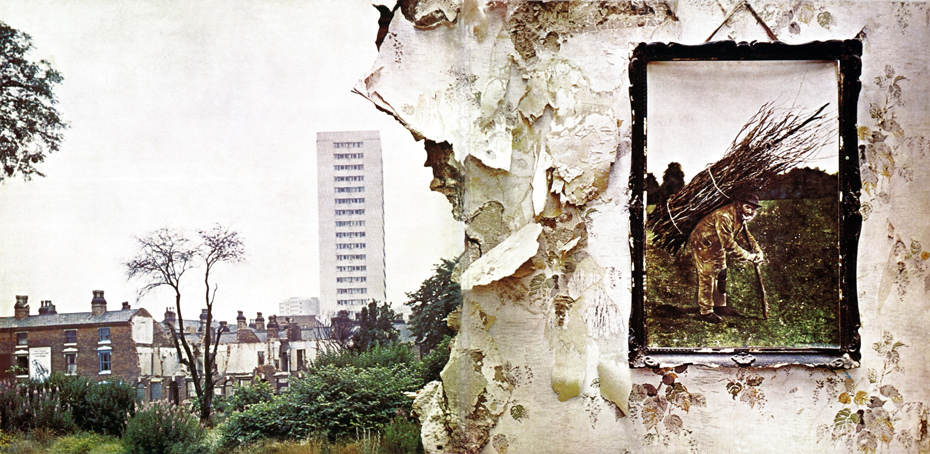
The man in the picture is Lot Long (or Lot Longyear, 1823–1893), a thatcher from Mere, Wiltshire. The photograph was taken in 1892 by Ernest Howard Farmer, the first head of the school of photography at Regent Street Polytechnic.
The image, which had previously been described as an oil painting, is a black and white photograph dating to 1892 which had been coloured by hand.
It was Robert Plant who came across that rustic image of the old stick-carrying man. He was browsing for interesting things in an antiques shop in Reading, Berkshire – incidentally, not too far from guitarist Jimmy Page’s house. Plant liked the image, bought it, and brought it to the band where he suggested that it be part of the cover somehow.
To create the actual image as it appears on the sleeve, the picture of the man was juxtaposed and hung on the inside wall of a dilapidated, partially demolished suburban house where it was photographed.
If you look at the full gatefold image, the section of the wall to the left of the image has collapsed, giving us a view of the neighbourhood outside which features a prominent block of flats. This part of the gatefold would end up being on the back sleeve. The block of flats in the image is Salisbury Tower, a 20-storey tower block on Middleway View in the Ladywood district of Birmingham. It was completed in 1968, stands 57 metres tall, and contains 116 flats.

Page has explained that the cover was intended to bring out a city/country dichotomy that had initially surfaced on Led Zeppelin III, and a reminder that people should look after the Earth. He later said the cover was supposed to be for “other people to savour” rather than a direct statement.

The inside sleeve of the gatefold has also been more than a bit myth-spinning over the years, with its mystical painting of a Gandalf-esque figure. The painting is called The Hermit by artist Barrington Coleby (credited to Barrington Colby MOM in the album credits), and is based on The Hermit (IX) from the popular Ride-Waite tarot deck. Jimmy Page played the role of The Hermit during a fantasy scene in Zeppelin’s 1976 movie The Song Remains the Same.
In some versions of the album, and related posters/imagery, some of the lyrics to Stairway to Heaven are included in a unique typeface. Page spotted the typeface lettering in an advertisement in The Studio – an old Arts and Crafts magazine from the late 19th century. He found the lettering interesting and wanted to use that style. As a lot of letters were missing, he arranged for someone to create a whole alphabet based on the letters they had.
At the time when the album was released, and for most of the years in the interim, the identity of the thatcher in the picture, as well as the photographer, was unknown. This information was not discovered until quite recently, thanks to Brian Edwards from the University of the West of England (UWE).
The mystery started moving closer to a resolution when Edwards found the original picture when looking through a photograph album for other research. As a long-time Led Zeppelin fan, he instantly recognized the man. While the framed image on the album cover is a colourised photograph (whereabouts currently unknown), Edwards found several variant photographs clearly taken at the same time.
Working out who the guy was started with identifying the original photographer (Ernest Farmer, who died in 1944). The only clue in the photo album was the photographer’s name, Ernest, but there were hundreds of Victorian photographers with that name.
The quality of the photos suggested they were taken by a professional, and so Edwards started looking for info on chemists during that time period, as many of them were involved in photography. He discovered a chemist working in Salisbury, close to where the picture was taken, who had a son called Ernest Farmer. Farmer would become the first head of the school of photography at the then newly-renamed Polytechnic Regent Street, now the University of Westminster.
The real breakthrough came when Edwards found examples of Farmer’s handwriting online. “Part of the signatures matches some of the handwriting in the photo album [containing the thatcher pictures],” Edwards told BBC Radio Wiltshire. “It was quite a revelation”. Edwards then set about researching thatchers from that time period, which suggested the man pictured was Lot Long, who died in 1893, a year after the picture had been taken.
The image has a long and interesting history. No doubt Lot Long would have found it unfathomable that an image of him would become known to millions due to its usage by a rock band some 79 years after it had been taken. It has made him one of the most recognizable men from his era, while to most, he is still unknown.
In January 2010, the album cover was selected to appear on a set of Royal Mail stamps celebrating iconic albums from the last 40 years. Only ten album covers were chosen, also including the Rolling Stones’ Let It Bleed, The Clash’s London Calling, and David Bowie’s The Rise and Fall of Ziggy Stardust and the Spiders from Mars.

Facebook Comments