")
Synchronicity is the fifth and final studio album by The Police, released on 17 June 1983. It was the band’s most successful release, reaching the #1 spot in both the UK and the US, selling over eight million copies in the US alone. Incidentally, this makes them one of the few bands whose last album was their most successful.
As with their previous album Ghost In the Machine, the recording for Synchronicity took place over a period of six weeks at AIR Studios in Montserrat, beginning in December 1982. Tensions in the band were high at the time, leading them to work separately as much as they could. They recorded their parts in three separate rooms: Stewart Copeland with his drums in the dining room (connected to the control room via video link), vocalist/bassist Sting in the control room, and guitarist Andy Summers in the actual studio.
There were still several arguments, which developed into blows between Sting and Copeland several times. Hugh Padgham who produced the album alongside the band described the tension as so bad he nearly left the project several times. Although the situation was often horrible, he later conceded that the tension is what ended up making it such a good album.
Sting was going through a particularly tough time. His first marriage had failed and he was going through a divorce, and his band was also showing serious interpersonal fatigue. He found himself exploring Jungian theory to make sense of things, and had started reading Arthur Koestler’s book The Roots of Coincidence (1972). It was partly influenced by Jung’s theory of synchronicity, which is the idea that seemingly unrelated events can be connected by a meaningful pattern. These “meaningful coincidences” of events usually have no actual relationship; they are connections between seemingly unrelated events that are not explained by causality or logic.
The concept ended up naming the album as well as two separate songs – Synchronicity I and II – and much of the other material was also inspired by Koestler’s book. Sting said in an interview with Time magazine at the time: “Jung believed there was a large pattern to life, that it wasn’t just chaos. Our song Synchronicity II is about two parallel events that aren’t connected logically or causally, but symbolically.”
In the song, Sting contrasts the mundane and depressing life of a father in a suburban family with the emergence of a monster from a dark Scottish lake.
The father feels trapped and frustrated by his job, his marriage, and his environment, and he senses that something has to change. The monster, which could be a reference to the Loch Ness Monster, is a symbol of the father’s inner turmoil and anxiety. The song suggests that there is a mysterious link between the two events, and that they are both manifestations of a larger pattern or force that transcends rational explanation.
Just like the philosophical thoughts around synchronicity ended up inspiring a lot of the material on the album, it would also inform the approach to the artwork. For all their arguments and disagreements, the band was fairly united around the idea of creating a visual representation of the concept of synchronicity.
They quickly found that you couldn’t do that with a single album cover design. This was the start of a madness that would give record collectors nightmare. The Synchronicity album is available in no less than 36 different cover variations.
The band signed on Norman Moore (a graphic designer who had worked with them before) to design the album cover. Jeff Ayeroff would also be involved in the art direction and album cover design.
The fact that Ayeroff took a personal interest shows the importance that was placed on this album, as he was also the senior vice president at Warner Records (the label that distributed the album in the US). He was skilled at developing visual campaign and also did this for Supertramp, ZZ Top, Prince, and Dire Straits, to name a few.
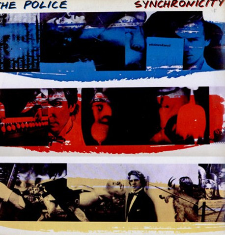
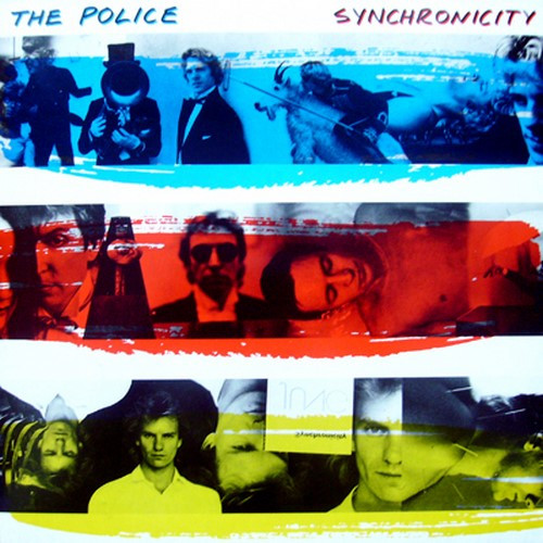
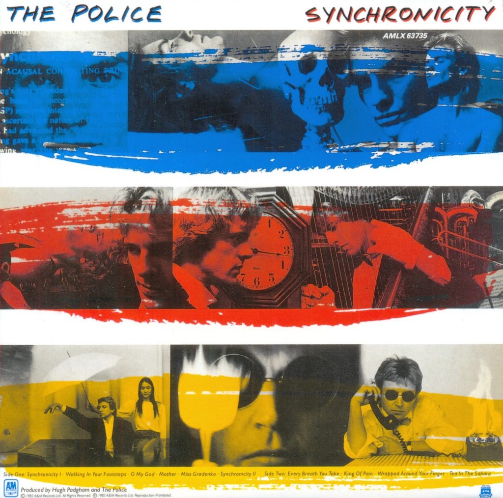
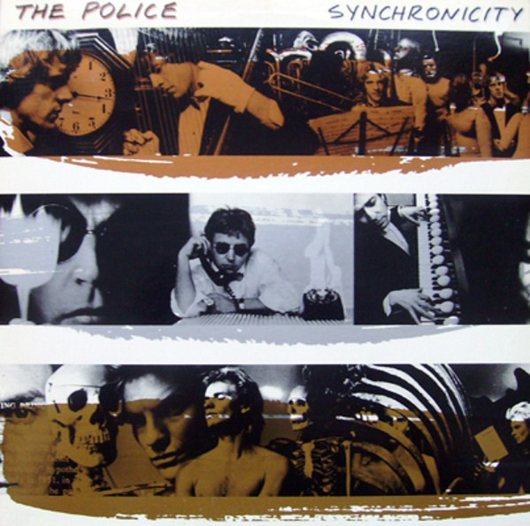
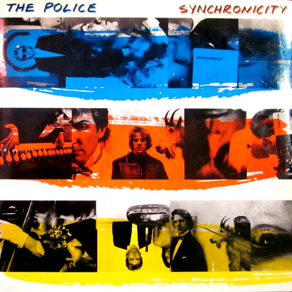
Moore came up with the idea of using horizontal stripes of different colours, each containing multiple images of the band members taken by photographer Duane Michals. After some experimentation, he landed on a design of three rows of black and white photographs, each overlaid with transparent horizontal stripes of bright red, yellow, or blue.
This basic concept made it easy for them to create many variations that were all still stylistically similar and quite recognizable as the new album from The Police. Some people probably never even noticed that some variations were different.
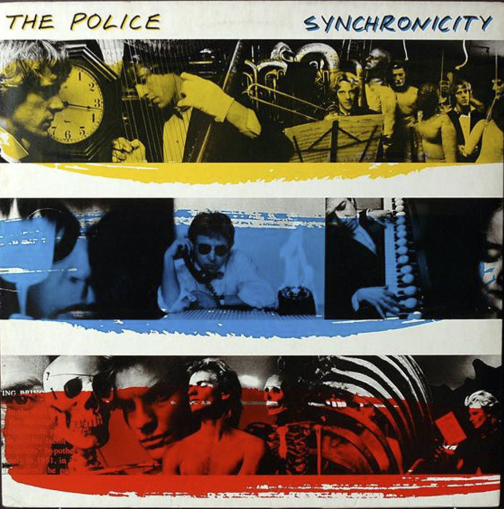
Each variation was meant to evoke a different mood or impression, and to challenge the viewer to find the connections between the images. Or, in the spirit of synchronicity, an imagined connection.
The most common version of the album cover features Sting reading a copy of Synchronicity by Carl Jung, giving the album a link to the man who coined the original term and developed the concept. This is featured along with a superimposed negative image of the actual text of the synchronicity hypothesis. A photo on the back cover also shows a close-up (but mirrored and upside-down) image of Jung’s book.
The many variations of the cover were made by having different arrangements of the colour stripes and showing different photographs of the band members, although the basic design – coloured stripes and photos, with band name and album title on top, gave them a similar appearance unless you paid special attention. If you did, you would notice the band members having different poses – sometimes playing instruments, just looking at the camera, or holding objects.
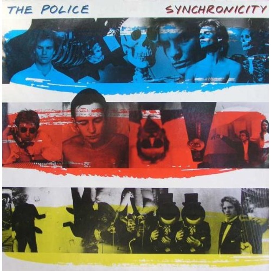
Some of the cover variations are rarer than others, such as the bronze, silver, and gold covers, and the black and white covers.
There has been some debate as to the actual number of variations available. According to the Goldmine Record Album Price Guide, there are 93, though a seemingly authoritative YouTube video puts the total number of U.S. vinyl variations around 40, although even that number depends a bit on how you count. To further complicate matters, some rare variations swap the usual colors for black and white or gold, silver, and bronze. There are also some highly individual versions existing in as few as one lone copy.
As fascinating as this can be, and no matter how deep this rabbit hole runs, the most important thing should be the music on the album. It was a vast bestseller for The Police, who may have been close to being the biggest band on earth at the time. It topped the charts worldwide and has sold over 25 million copies over the years.
The album cover made the release that much more interesting, and was widely praised for its originality and creativity. It certainly is one of the most iconic and recognizable album covers of its era.
Facebook Comments