
Big Country released their classic debut album The Crossing on 29 July 1983. Musically, the album is as good as it gets – even making it into the Top 10 when Classic Rock Magazine counted down the 100 best debut albums of all time in 2018.
Today, however, we will leave the music aside and look at the album cover.
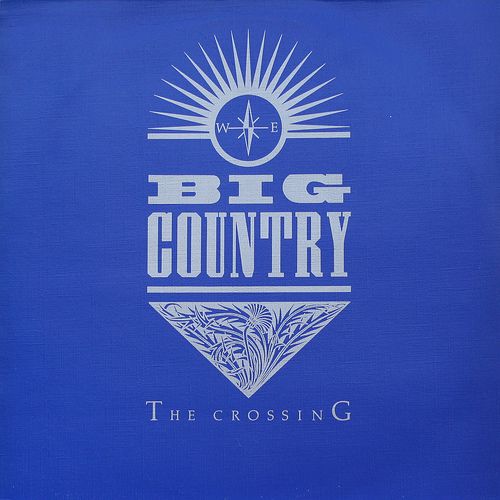
Or, should we say album covers? There are several colour variants of it: blue, red, and green, and a few special versions which really don’t count (such as the white South Korean version with green or black lettering).
The discussion on which colour works best has become quite the fan discussion in recent years, with fans forming different colour camps taking good-natured jabs at each other. The basic design is however the same no matter which background colour we’re talking about.
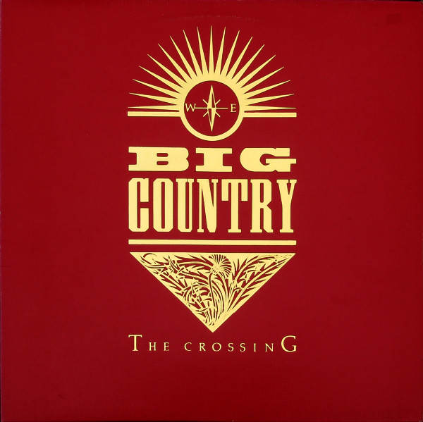
Rather than featuring an image, the cover consists of a series of simple designs that are put together to produce a striking and memorable whole. All of these designs would be embossed in the album’s initial print run for additional effect.
The designs consist of a compass motif on top with the band logo underneath. A triangular floral design below the logo features a thistle – Scotland’s national flower. The album title is written across the bottom in clear, effective lettering. These designs are done against a clean, clear, striking background colour.
The result is very effective whether we’re talking about the blue, the red, or the green sleeve.

The symbols on the blue background were initially embossed using a silver-like foil, later represented by light grey lettering. The red one initially featured embossed golden foil, later represented by light yellow lettering. Some reproductions in countries with less quality proofing would sometimes use white lettering for any of these, which may work, but that is not correct according to the initial designs.
Initially, the album was released in blue and red only, designed by the mysterious J.B. (who we’ll get to shortly). The version with the green background followed later, in March 1984, and was designed by Andy Murray. It featured gold lettering, giving a particularly lovely effect as an embossed record sleeve. The green/gold colour combination gets less effective in plain, non-embossed form, and can even be hard to read on smaller formats, but there is no doubt that the embossed green/gold variant is particularly beautiful.
So who designed the cover art for The Crossing? The liner notes don’t give a lot of clues. «Sleeve by J.B. & Q. Branch». Hmm.
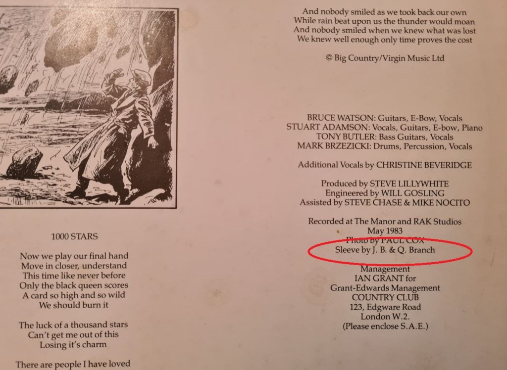
The acronym J.B. hides a friendly chap with the name Julian Balme. Julian has designed over a thousand single & record sleeves from the late 1970s and well into the 1980s, in addition to related art (tour books, promotional artwork, etc). Many of them are iconic sleeves that we all know very well without knowing they came from him, including The Clash, Iggy Pop, Tears For Fears, Imelda May, Psychedelic Furs, INXS, Madness, Pete Townshend, Paul Young, Bruce Springsteen, Delmange, Psychedelic Furs – and Big Country.
Julian was interviewed by the Big Country podcast The Great Divide in 2013, and spoke extensively about his time working with Big Country from 1982-1986. Julian’s quotes mostly come from that interview.
Julian got involved in the music industry as soon as he left art school – or actually before, as he had started working for Stiff Records two days a week before he left college. He would go on to work full-time for Stiff for about a year.
“The first single sleeve I did for Stiff Records was for Pete Townshend,” says our J.B. “He did a very strange single in 1979, which had a 13-year old girl singing lead vocals. It was called Peppermint Love, and Tony Butler was it featured on the sleeve as well! So that was the first member of Big Country I met, several years early.”
Julian would work as a freelancer for a few years before the call came to work for Big Country. “I got introduced to Big Country through their product manager at Phonogram. I was working freelance at the time and my two biggest clients were The Clash and Adam and the Ants. As a result I was working a lot for CBS. Suddenly I got a call out of the blue – completely out of the blue! – from a guy at Phonogram called Bob Fisher. Phonogram had got a couple of new acts, including Tears For Fears, which was who Bob called me about. I ended up doing some work with him for Tears For Fears. He was so pleased with that, and we were obviously starting quite a good relationship. When Big Country signed, it was like, ‘come in and meet them, they are coming down from Scotland. We’ll have a meeting at the office.’ I can’t remember who was in the meeting, I think it might just have been Bruce and Stuart. Their A&R man Chris Briggs was also there.”
Julian knew Stuart from his Skids days and was keen to see what he was up to in his new band. He discovered that the creative process as far as art direction had already begun when he got into the picture.
“They had already had a photo shoot done with Chalkie Davies. They had already got their look together, with the plaid shirts and everything. And Chalkie had done a shoot with them, and I was called in rather late in the day. What they were talking about was their first single, which I did the sleeve for pretty quickly.”
That would have been the Harvest Home single, released in September 1982. That was the first time the Big Country logo was used, and when Julian arrived he found that the idea for the logo was already on the table.
“Stuart had actually come up with an idea for the Big Country logo,” Julian says. “He wanted the ‘Big’ to be wide and ‘Country’ to be tall. That was the only direction that was given, and based on that, I put down a design which is the Big Country logo that has been used pretty much since.”
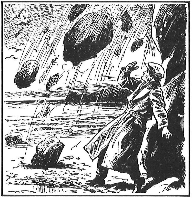
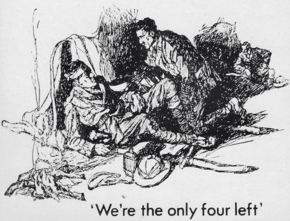
The logo was a very important part of the parcel for sure. There were still things to figure out, and Julian remembers the discussions that were going on. They would eventually lead to the iconic adventure imagery from Boy’s Own manuals that played an important part of the inner sleeve and singles.
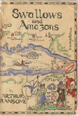
“We did talk a lot about the premise of Big Country,” Julian remembers. “When you first walk into a meeting with a band called Big Country, you assume it’s going to be a country & western band. When they explained to me their ideas for what Big Country meant to them, I wonder now whether that in hindsight led to the whole vibe of those Boy’s Own manuals. I wondered if they were some sort of childhood thing of Stuart’s, something he had grown up with. And they were very popular in the 1940s and 50s, those books. Swallows and Amazons wasn’t mentioned, but that was another childhood novel that featured maps and things like that. It fit in with the Boy’s Own as being part of the exploration theme, with compasses and things like that.”
When those books were brought up as a point of reference, Julian started the work of tracking them down, which wasn’t too difficult. “There was a book publisher in Scotland called Blackie’s. They were responsible for doing a lot of the Boy’s Own manuals.”
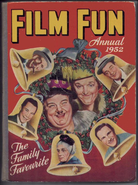
A lot of the illustrations ended up being picked from an annual (Film Fun from 1952), which collected a lot of the Boy’s Own content from recent years.
Those vintage adventure-style drawings would become an important part of the art direction for the first album campaign. There was talk of featuring one (or several) of those on the sleeve itself, but that did not work out.
Julian Balme is very proud of what they created at the time. “I was really pleased with The Crossing sleeve. It was a case of, if you couldn’t have your Boy’s Own manual illustrations on there, you would have a plain colour with the logo embossed on it, and that’s what happened.”
The front cover may not have featured any of the classic Boy’s Own illustrations, but the album’s inner sleeve is peppered with them. Some of them are filled with action, some are dramatic, and others convey a feeling of ambience and/or foreboding. A lot of the early singles have maps and the same kind of illustrations on them. It all added a lot to the sense of adventure.
Stuart talked about these illustrations in an interview with Record Mirror (27th August 1983): “…Stuart then lets slip a surprising influence on the striking artwork on the album – comics. ‘I think the images on the cover are maybe borrowed from the Eagle or the Hornet,’ he admits. It seems Stuart was a great reader of such things and, warming to the subject, he continues ‘Aye, and the Dandy and the Topper as well – and the Bunty.’ He laughs and begins to get almost excited. ‘I’ll always remember the Four Marys – and you’d get cut-out figures on the back. They’d always be stories too, about girls being stopped from being ballerinas or gymnasts by their wicked uncles even though they had great natural talent for it.’ He laughs and offers the explanation, probably just in case anyone thinks he’s a cissy, ‘I used to read them round my Gran’s.’ Suddenly he comes over all nostalgic and proclaims in a voice full of warmth and emotion ‘Winker Watson – Oh brilliant.'”
Only one time was the art director and band put under pressure to amend their intentions somewhat. “The only compromise we made was to actually put the image of the band at the back of the sleeve. We wanted to try and get away from even having that picture on the back sleeve, but there was pressure brought in at the last moment, so we did end up putting it in. But our problem was, if you have a striking sleeve that works in just two colours, how do you suddenly introduce a picture of the band? We ended up rendering it like a scratch image to make it fit.”
A lot of people have reached out to Julian over the years asking if he has rejected ideas from his time working with any of ‘his’ artists. There were never really any rejected ideas, which comes down to Julian’s way of working.
“Primarily I am translating their ideas. My biggest problem as a designer is that I would always be more concerned about the wishes of my client rather than my own wishes. I was always very concerned about my band’s character and that that came through rather than my own. So there wasn’t any wasted time as regards my coming up with ideas, because I am interpreting an idea I was already given. The only sort of changes that would come in would be things like, ‘How would that look in blue?’ And for The Crossing, we tried several colours, and ended up using a few of them.”
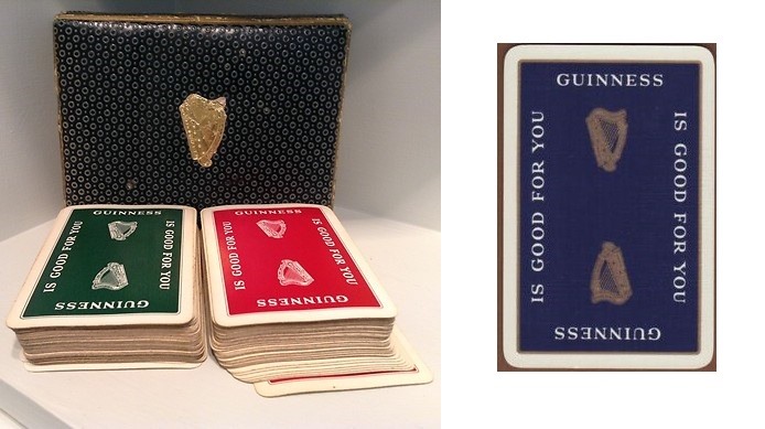
Blue and red came out earlier than the green. Why those colours? “They were based on a twin pack of playing cards I had,” says Julian. “One backed in red, the other in blue. I think they had a Guinness harp logo in gold on them centred in the middle. In fact we ended up doing a twin pack of cards the same as a promo item with a Big Country logo on the back.”
Some “art rarities” with unique designs from The Crossing era also exist. “We did design a special set of promotional cards. They were given out to dealers as incentives back in the day.”

As mentioned initially, Julian did not sign his work or get attributed his works in album sleeve notes by his own name. He would use the initials J.B. Why the secrecy?
“Oh, it was so cool back in the day. Haha! My big hero and the guy that I used to really look out to was a big designer called Barney Bubbles. Barney had been at Stiff Records before me. I just idolised Barney. I thought he was great, and anything that was good enough for Barney was good enough for me. Well, of course, Barney had such a distinctive style that he can leave his name off a record sleeve and everybody still knows that it is one of his. So I thought, ‘Oh, it would be very cool not to put my name on the sleeve.’”
The sad thing about it now is that Julian may have lost out on royalties for his images because people don’t know who made a lot of them. “Back in the day, that was a cool thing to do, but of course 30 years later, the publishing of album sleeve books… you know, things like “1001 Great Album Sleeves”. Christ knows how many of those books they have sold. They always feature a load of my sleeves, and they are always credited to “Designer: Unknown.” Other people have even been credited with designing my sleeves. And I think, ‘Hey! I did that!’ I should put out my own book and set the record straight.”

Julian has long since left the music industry behind. For the last three decades he has worked under the banner of Vegas Design, being involved in all aspects of brand creation, identity development, design and marketing for the art, publishing, and classic car world.
He does however look back at his time in the music industry fondly. “It was a fantastic period to do record sleeves,” he says. “Each band I did – The Clash, Tears For Fears, Paul Young, Psychedelic Furs, Big Country – are very different because the bands are different. That was my thing. Many of my contemporaries were fantastic, but nine times out of ten their work was more about them than their bands. ”
Not only was he responsible for the art for three of the most revered Big Country albums and related singles – he also created the Big Country logo based on the input the band gave him. Julian’s contribution to the classic era of the band was massive, and he deserves to be remembered as more than a mysterious J.B. who is buried somewhere in the liner notes.
Julian is humble about his role in the whole thing, but is pleased that what he made all those years ago is still fondly remembered. “I saw someone wear a The Crossing t-shirt in my local supermarket recently,” he says with a smile. “That was great!”

Facebook Comments