The original idea for Big Brother And the Holding Company was to call their second album Sex, Drugs And Cheap Thrills. Columbia (their record company) nixed that idea, and so a simple Cheap Thrills it was!
The title was not the only thing Comumbia nixed. The group’s original cover idea was a photo of all of them naked in bed together. Instead, legendary cartoonist and record collector Robert Crumb ended up designing the iconic artwork.
Dave Getz (drummer) said, “We were sitting around in our loft one day and I said, ‘What do you think about asking R. Crumb to do it?’ Everybody said, ‘Yeah, that would be far out.’ We were all reading his Zap comics and thought he was a genius. I had a way to get in touch with him through a friend and Janis wanted to be the one to call him.”
Joplin ended up talking to Crumb, who came over and sat on the floor in a corner of their dressing room at the Carousel Ballroom (later the Fillmore West) where they were playing. He watched what was going on and took Polaroid pictures of everyone in the band, without really speaking much to anybody. Then he went home.
Crumb later spoke of the assignment, saying “I was flattered, and I needed the money, so I did it… Of course they needed it, like, the next day, so I took some speed and worked all night on it.”
The next morning he called Janis and said it was finished. Janis picked up the artwork boards from him and took them over to their rehearsal place so they could all take a look.
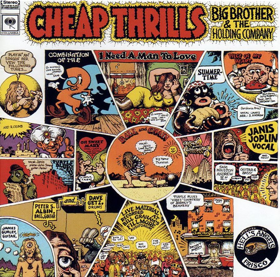
The band’s initial reaction was lukewarm. “For the front cover,” Getz said, “he had drawn and painted what looked to be a school auditorium stage, and on the stage were these stick figure musicians, onto which he’d cut and pasted the heads from the Polaroid pictures. And it had the backs of heads of the people in the audience. It was kind of funny, it was OK. But when Janis showed us the back cover, no one wanted to look at the front cover any more. We all said, ‘Are you kidding? This is the back cover? This is incredible!'”
They all loved the design for the rear sleeve, and it was quickly decided to use that on the front instead. This is why there are different windows introducing the band, with one providing information on where the material was recorded.
Most iconically, a comic strip-style Janis Joplin introduces a series of windows with: ‘Playin’ an’ singing fer yew the following tunes…’ Each song is then represented by an image, which is also written out for those who can’t put two and two together.
From the literal Ball And Chain to the slightly more frivolous Combination of the Two, Crumb’s artwork opened the floodgates for him and he was still receiving requests to do album sleeves as late as 2005.
Keen to give the artist credit, and perhaps add some credibility to the release, they added a credit saying “Art: R. Crumb” in one of the balloons, using Crumb-style lettering. Crumb did not know anything about this until the album came out. He was so infuriated that he swore he’d never do another album cover, and even refused to take the $600 fee. “I don’t want Columbia’s filthy lucre,” he famously said.
He did make peace with the band several years later, and even made some money from the drawing as he managed to authorise the sale of prints, some of which he also signed.
A good album cover can contribute to an album’s success, and a few months after its release on 12 August 1968 it reached the #1 spot in the US Charts where it stayed for eight (nonconsecutive) weeks.
Facebook Comments